Chart With Table
Basic Example
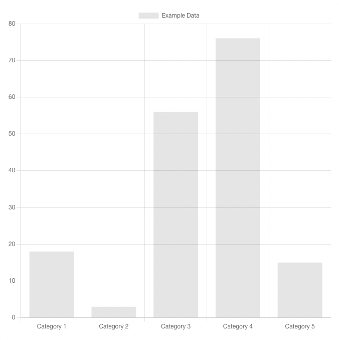
A basic <ChartWithTable> element using Bootstrap 5 for styling. This component renders both a chart and a basicTable component, and additionally adds a function to download the source data as CSV. It is worth noting that this accepts the chart component as a prop, so in your page definition you would choose this component as your chart's component value, then include the actual chart you'd like to render as a prop called chartComponent.
Usage
kebab-case
<chart-with-table :chart="{ key: 'exampleChartWithTable' }" :chartComponent="barChart"/>PascalCase
<ChartWithTable :chart="{ key: 'exampleChartWithTable' }" :chartComponent="barChart" />Page Definition
import { components } from '@rtidatascience/harness-vue-bootstrap'
components['ChartWithTable'] // array syntax
components.ChartWithTable // object syntax
Page Definition Example
// in a page definition's charts section
{
    chartKey: {
        title: "chart title",
        component: "HarnessVueBootstrapChartWithTable",
        props: {
            chartComponent: yourChartComponentHere
        }
    }
}
Props
chart
The chart object to render (Note: this is automatically handled by ChartGrid, so if you are using the grid you don't need this in your page definition).
- Type:
Object - Required: Yes
chartComponent
The component you would like to be rendered for the chart portion of this component.
- Type:
[Object, Function] - Required: Yes
showDownloadButton
Adds a download button that downloads a CSV representation of the chart data.
- Type:
Boolean - Required: No
- Default:
true
Example downloadable false
<ChartWithTable :chart="{ key: 'exampleChartWithTable' }" :chartComponent="barChart" :downloadable="false"/>buttonPosition
Directs butttons to be in the card header or footer.
- Type:
String - Required: No
- Options:
'header''footer'
- Default:
'header'
Example button bottom
<ChartWithTable :chart="{ key: 'exampleChartWithTable' }" :chartComponent="barChart" :buttonPosition="'bottom'"/>showTableButtonText
Allows a user-specified label for the toggle button to show the table component.
- Type:
String - Required: No
- Default:
'Show Table'
showChartButtonText
Allows a user-specified label for the toggle button to show the chart component.
- Type:
String - Required: No
- Default:
'Show Chart'
downloadButtonText
Allows a user-specified label for the download button.
- Type:
String - Required: No
- Default:
'Download as CSV'
Example with custom button labels
<ChartWithTable :chart="{ key: 'exampleChartWithTable' }" :chartComponent="barChart" :showChartButtonText="'Show Me The Chart'" :showTableButtonText="'Show Me The Table'" :downloadButtonText="'Give Me The CSV'"/>titleDisplayContext
Specifies when the title is displayed based on the view. Omitting this prop will display the title in both views.
- Type:
String - Required: No
- Options:
'chart''table'
- Default: null
Example with conditional title
<chart-with-table :chart="{key: 'exampleChartWithTable', title: 'Example Chart'}" :chartComponent="'barchart'" :titleDisplayContext="'table'"/>Slots
This component also has named slots for adding additional content such as buttons and text elements.
Additional Buttons
<chart-with-table>
    <template v-slot:additional-buttons>
        <button class="btn btn-sm">Custom Button</button>
    </template>
</chart-with-table>Above and Below Chart Options
<chart-with-table>
    <template v-slot:above-chart>
        <p class="lead">This is some additional data about the chart.</p>
    </template>
    <template v-slot:below-chart>
        <h3>References</h3>
        <ul>
            <li>Reference 1</li>
            <li>Reference 2</li>
        </ul>
    </template>
</chart-with-table>This is some additional data about the chart.
Here are some chart notes.