Chart Grid
Basic Example
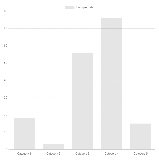
A basic <ChartGrid> element using Bootstrap 4 for styling. The ChartGrid component works largely the same as the FilterGrid - it renders the components specified for each chart in the page definition into a bootstrap grid. It can also accept a subset and a number of columns.
Usage
kebab-case
<chart-grid />PascalCase
<ChartGrid />Props
only
Only filters with keys in this array will be rendered. Filters will be rendered in the order created on the harness page.
- Type:
Array - Required: No
Only ['exampleTable'] Example
<ChartGrid :only="['exampleTable']"/>orderByOnly
Pairs with order prop to order ChartGrid based on the order of filters in only.
- Type:
Boolean - Required: No
- Default:
false
orderByOnly ['exampleTable', 'exampleChartWithTable'] Example
<ChartGrid :only="['exampleTable', 'exampleChartWithTable']" :order-by-only="true"/>except
Only filters with keys not in this array will be rendered. Filters will be rendered in the order created on the harness page.
- Type:
Array - Required: No
Except ['exampleChartWithTable'] Example
<ChartGrid :except="['exampleChartWithTable']"/>columns
The number of columns to use in each row of the grid. Must be a divisor of 12, as this uses the Bootstrap Grid. Default is 1.
- Type:
Number - Required: No
- Options:
1-12
- Default:
1
columns 2 Example
<ChartGrid :columns="2"/>rowClass
A string appended to the class of each row div element, for applying bootstrap grid options. This can also be used for applying user-created classes as well.
- Type:
String - Required: No
- Default:
null
rowClass align-items-end Example
<ChartGrid :columns="2" :row-class="'align-items-end'"/>colClass
A string appended to the class of each col div element, for applying bootstrap grid options. This can also be used for applying user-created classes as well.
- Type:
String - Required: No
- Default:
null
colClass align-self-end Example
<ChartGrid :columns="2" :col-class="'align-self-end'"/>componentClass
A string appended to the class of each component element, for applying bootstrap classes. This can also be used for applying user-created classes as well.
- Type:
String - Required: No
- Default:
null
componentClass alert-success Example
<ChartGrid :component-class="'alert-success'"/>spread
If true, any rows with less charts than columns will expand to fill the space rather than enforce the grid size set by columns.
- Type:
Boolean - Required: No
- Default:
false
spread false Example
<ChartGrid :columns="2" :spread="false" :component-class="'alert-success'"/>spread true Example
<ChartGrid :columns="2" :spread="true" :component-class="'alert-success'"/>